About Item Type Action Form Policies
Item Type Action Form Policies control the design and behavior of user interface forms in EmpowerID. These policies use JSON to define form layouts, field elements, and functionality, allowing organizations to customize forms for different user actions and resource types without modifying core system functionality.
This article explains what Item Type Action Form Policies are, how they work, and how they are structured.
What Are Item Type Action Form Policies?
Item Type Action Form Policies define how UI forms appear and behave when users perform specific actions on specific resource types. Each policy combines three elements:
| Element | Description | Example |
|---|---|---|
| Action Type | The operation being performed | Edit, Create, View |
| Item Type | The resource type being acted upon | Person, Group, Account |
| Form Configuration | JSON defining the form's layout and fields | Field types, validation, layout |
For example, when an administrator edits a person's attributes:
- The action type is Edit
- The item type is Person
- The applied policy is the Edit Person Item Type Action Form Policy
Use Cases
Item Type Action Form Policies enable you to:
- Customize form fields — Make fields required, read-only, or hidden
- Create role-specific forms — Show different fields to different user groups (e.g., employees vs. contractors)
- Apply conditional layouts — Display forms based on roles, locations, or group memberships
- Add validation — Enforce data formatting with regex patterns
JSON Structure
EmpowerID uses a row-based JSON structure to configure form policies. The two primary objects are dynamicFields (form layout) and accessDetails (related data).
dynamicFields Object
The dynamicFields object defines the form layout using rows, with each row containing one or more fields.
Basic Row Structure
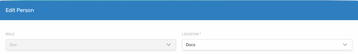
{
  "dynamicFields": {
    "Row1": [{
      "width": 50,
      "localeKey": "Role",
      "fieldName": "primaryOrgRoleId",
      "fieldType": "tree",
      "apiUrl": "/api/lookups/businessrolestree",
      "required": true
    },
    {
      "width": 50,
      "localeKey": "Location",
      "fieldName": "primaryOrgZoneId",
      "fieldType": "tree",
      "apiUrl": "/api/lookups/businesslocationstree",
      "required": true
    }]
  }
}
In this example, Row1 contains two fields (Role and Location), each occupying 50% of the row width.
Subcolumns
Fields within a row can be further divided using subcolumns:
{
  "Row2": [{
    "width": 50,
    "required": true,
    "subColumn": [
      {
        "width": 70,
        "localeKey": "FirstName",
        "fieldName": "firstName",
        "fieldType": "text"
      },
      {
        "width": 30,
        "localeKey": "Infix",
        "fieldName": "title",
        "fieldType": "text"
      }
    ]
  }]
}
This creates a row where the first 50% is subdivided into First Name (70%) and Title (30%).

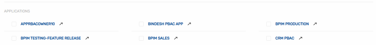
accessDetails Object
The accessDetails object specifies related data to display on the form:
{
  "accessDetails": {
    "apiEndPoint": "/api/applications",
    "friendlyName": "Applications",
    "type": "Application"
  }
}
Field Configuration
Common Field Attributes
| Attribute | Description | Required |
|---|---|---|
width | Percentage of row width (1-100) | Yes |
fieldType | Type of form element | Yes |
fieldName | Data property linked to the field | Yes |
localeKey | Label text (supports localization) | Yes |
required | Makes the field mandatory | No |
disabled | Makes the field read-only | No |
apiUrl | Data source for dropdowns and trees | Conditional |
validationRegex | Regex pattern for input validation | No |
validationMessage | Error message for validation failures | No |
Supported Field Types
| Field Type | Description | Example |
|---|---|---|
text | Standard text input | {"fieldType": "text"} |
dropdown | Single-selection dropdown | {"fieldType": "dropdown", "apiUrl": "/api/fetchOptions"} |
multiSelectedDropdown | Multiple-selection dropdown | {"fieldType": "multiSelectedDropdown", "apiUrl": "/api/fetchOptions"} |
tree | Hierarchical selection | {"fieldType": "tree", "apiUrl": "/api/fetchTree"} |
phoneWithCountryCode | Phone number with country code | {"fieldType": "phoneWithCountryCode", "countryCode": "+1"} |
Example: Edit Person Form
The Edit Person form in Resource Admin demonstrates how Item Type Action Form Policies customize the interface.
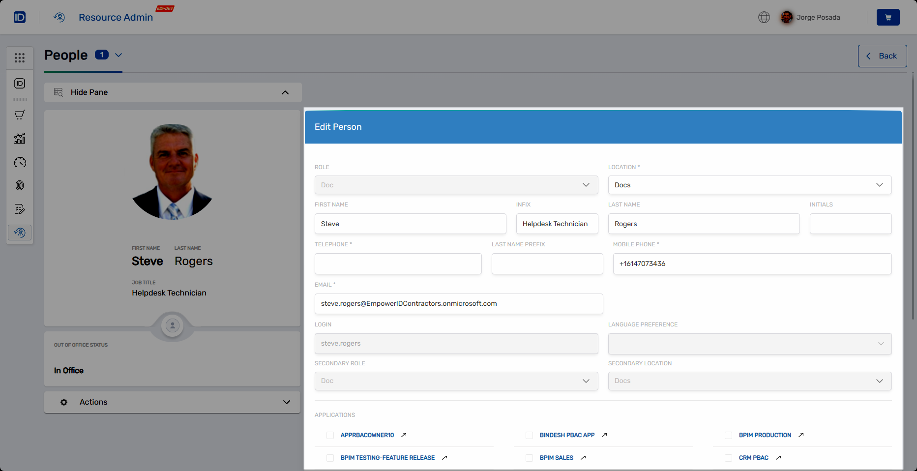
This form is defined by the Edit Person Item Type Action Form Policy, which specifies:
- Row layout with Role and Location tree selectors
- Personal information fields with subcolumn layouts
- Required field indicators
- Read-only fields where appropriate
- An access details section showing related applications